The current marketing strategy for Kinos is using School canteens and shops to sell its product. Having a unique selling point of being the Most enjoyed snacks for children in Malaysia at its time. Problem is, Kinos only sells its product locally and I want to try and make the product enter the International market.
There are 3 countries I would like to sell my product to, they are USA, China and Russia. In USA, I observed that they sell their products snack products inside vending machine. The vending machines can be convenient and can be found most of the time almost everywhere. China has a treading market for Chocolate products which would be beneficial for Kinos chocolate products. The children there also loves toys as well. Russia has ways to sells its product with mobility by using trucks and it can be set up anywhere and pack up anytime. Russia also has small stalls which is easy to set up and it is found mostly in parks. These strategies could benefit Kinos to sells its product in these ways within Malaysia as well as other countries.
Sunday, 24 January 2016
website
This week, I am going to design a new website for Kinos. Why I wish to change the website is because the current site looks unsuitable for a company that sells junk food. The original site has a nature theme it shows a journey however where its goal has not much meaning other than showing a treasure. Images also phases out and in too early and the navigation panel sometimes is covered by the illustration. So, I wanted to design a more clear site without losing much on the illustration and also making the site having the 80s feel in it.

Photo 1
First, I started sketching the layout of the site. I decided the resolution would be 1440 x 900 pixels as it is the most suitable size for large screens and most browsers would adjust itself with smaller ones. The website would consist of 4 pages with pages Main, About, Product, Tv ads and Contact.

Picture 1

Picture 2

Picture 3

Picture 4

Picture 5
The picture above shows my website, showing 5 pages and each of their tabs accordingly. The navigation panel would be on top and an icon would be shown for other pages and its name for current page. The main page has a slide show of products with navigation arrows. The about page will have animated chocolate balls rolling the chocolate balls into its product box. Product page would show its products accordingly and has clickable links to the product . The Tv ads link connects to you tube of the Kinos product video. Finally, the contact page with all the contact info about Kinos.
Saturday, 23 January 2016
Cabinet contruction

Sketches
This week, we plan to build a cabinet for displaying our collected pigments and color test. We are assigned in two groups to work together on the display. So, we sketched some ideas for the display. Then, we gathered some recyclable woods to use. Most of the wood we found are in the workshop at our college. However, the wood has nails at each end and it is hard to get it out. We decided to saw it off instead by measuring the sides of the wood. Creating a small pencil mark we then make small cuts on it as guideline. It took us some time to saw off the sides of the wood. Do note we do not have much experience as a carpenter so our sawing is more or less flawed. We plan to make a simple cabinet able to fit both of our storage containers. However it requires a total of 7 wood and sawing them off one by one took quite a long time.
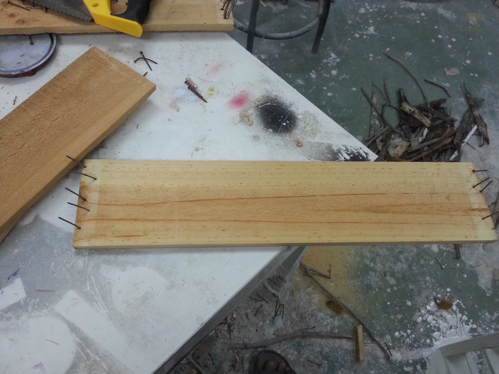
Wood with nails to the side

Guideline on cutting the side of the wood

Done sawing 6, one more to go
After all the wood had been sawed we began nailing the wood together. My partner is a girl however so I had to do the hammering work while she helps put pressure and stabilize the wood. The nails we use are also recycled so it may look rusted but it is still usable. Though, having no skills at carpeting I sometimes made errors when hammering. Sometimes, the wood would go out of place and some nails would be hammered in wrongly. The experience is tiring and took quite sometime to get done. It was a good start for my first experience.

Checking the stability

Hammering the nail
Finally, we finished our cabinet and displayed it outside an empty space with our storage containers and color testing experience. Although, it did not turn out very good as it obviously displayed construction flaws. I am quite happy with it as my first time doing stuff like this and it would serve a good experience in the future.

Full view

Photo of the cabinet

Color display area
Taglines and Nametag

Photo 1
We are required to create Name card for our product, so we would have to create taglines that would go well with it. Taglines would need to be client base, meaning it must be inspiring words from the consumers. The photo above shows some of the few taglines I have come up with and I require to choose 3 for font testing.

Picture 1
Here are the 3 taglines I have chosen, I separate each with its own font which I keep for later use when I find it fitting. I choose the one that I have colored because It was a past experience when I have tried Kinos. The color is not finalized It is just to show which tagline I want to go with.

Name card Front

Name card Back
After choosing my Tagline and color, I then proceed in making my Name card. The front is simple with the logo and tagline. The back shows the contact details and some illustrations.
Logo variants
Here are some of my Logo color variants :

I used red as main color as the colors of the flag china and Russia in mind.

A more chocolate variant

Similar to the original logo but since its a Sailor i tried making the blue more oceanic color and sky background.


A more USA flag variant. Both looks pretty nice to me and the logo to the right can also be Malaysian flag.
Logo Progress(finalizing)

Picture 1

Picture 2

Picture 3

Picture 4

Picture 5

Picture 6

Picture 7
After editing, I then scaled it and made Black and white versions as well as an inverted version. The modified logo looks a lot better compare to the old one but there is always ways to improve it.
Friday, 22 January 2016
Mascot

Photo 1
This week, I am tasked to create a mascot for my re branding. Using the logo I designed I would need to add a body to it. So, I sketched out how would my mascot would look like.

picture 1

picture 2

picture 3
After that, I begin designing digitally using the original Icon. In picture one was a trial design based on the sketch. It looked uninteresting and normal so I decided to exaggerate some parts like the head. I redesigned the mascot and gave it a smaller but human fit able sized body. Changed the closed eye to a open one so the human inside the head would be able to see. I wanted to make a bigger NINI snack cup but my lecturer voted against it so I made it a normal sized one instead. Picture 3 shows the finalized mascot.
logo progress

Photo 1
Starting with a sketch from the original logo, I sketch out how it would look in front view. I also try sketching different types from the original but I decide to maintain it because I want to keep some of the originality of the logo.

Picture 1

Picture 2
When designing a new logo, I decided to maintain its outer circular shape. With my reference of the original logo to the top right, I used the pen tool to freely draw the face of the logo. By estimating how the sailor would look like in a front view perspective, I would think the chin or mustache would ruin the logo also adding the chin would look like Popeye which would subject to copyright laws. Instead I decided to ake the sailor younger looking.

Picture 3

Picture 4

Picture 5

Picture 6
I then continue with detailing the new sailor starting from his cloths, when that is done I used the duplicate and reflect option, I then alight the copied side to the original side using the ruler. But, I notice it gives me odd shape on the head so I deleted the top of them both. So, I created a sailor hat separately tracing it with pen tool and drawing it as an individual object

Picture 7
Finally, I added the details of the logo like the eyes, hair, mouth and nose . I also changed the nose and mouth a bit to give it a more funny look. Then I added colors of the cloth and background according to the logo. However, this is not a finalized colors and modifications . It will be assessed by my lecturer and criticized by my fellow peers first before I actually finalize it.
Monday, 18 January 2016
Digging for Pigment(Manual work)

Dengkil
This week, we are going to Dengkil to experience digging, finding and gathering of pigments. We parked at a road side of Dengkil. We then take out our tools and boxes to hold the pigment. The day was in the afternoon so it was very hot.

Digging up pigments

Looking for pigment

Chuck of pigment
Sometimes, we dug up various sizes of pigments even as large as the ones in the picture above. Though, most of the colors that we collected ranged from red to orange at this location. There are also different types of color in other parts of the road side but it requires us to cross roads and is quite far.

A mountain of pigments

Pigment everywhere

Pigments collected

Filling up the containers

Labled and complete
After the experience, we had launch in a random mamak stall but the food there was expensive. We drove back to Suhu workshop after that and help take out the collected pigments from the trunk of the car. Overall, we had alot of pigments collected in plastics as well as alot of chucks of pigments from Dengkil. Then, we took our containers and filled them with pigments. After filling them up with different colored pigments we then labeled the pigment color and location. The lid is kept open so that water and oil can evaporate. We left it there overnight and went back to our college. It was an interesting and very tiring experience. This also tells me how hard it is for artist in the past gets their colors without advanced technology.
Subscribe to:
Posts (Atom)